

T he Microsoft Reactor Hackathon Event FY2025 was my first official competition with other individual developers or teams of up to 4. I got to see some seriously impressive submissions and with over 500 other notable projects, I was up against some of best in the nation.
From Projects to Production
I uploaded Data Forge Lite, a streamlit app that would allow non-technical users upload any size dataset (under 200mb). The application would then take the user from data ingestion, to interactive mind mapping, to data visualization and storytelling.
“Mission Blue Scorpion came from my zodiac sign. Someone told me I was a water scorpio or something and I thought that sounded cool.”
Inspire, Teach, Grow
“I just wanted my students to feel jazzed about going to coding class and feel a sense of teamwork and comraderie.”
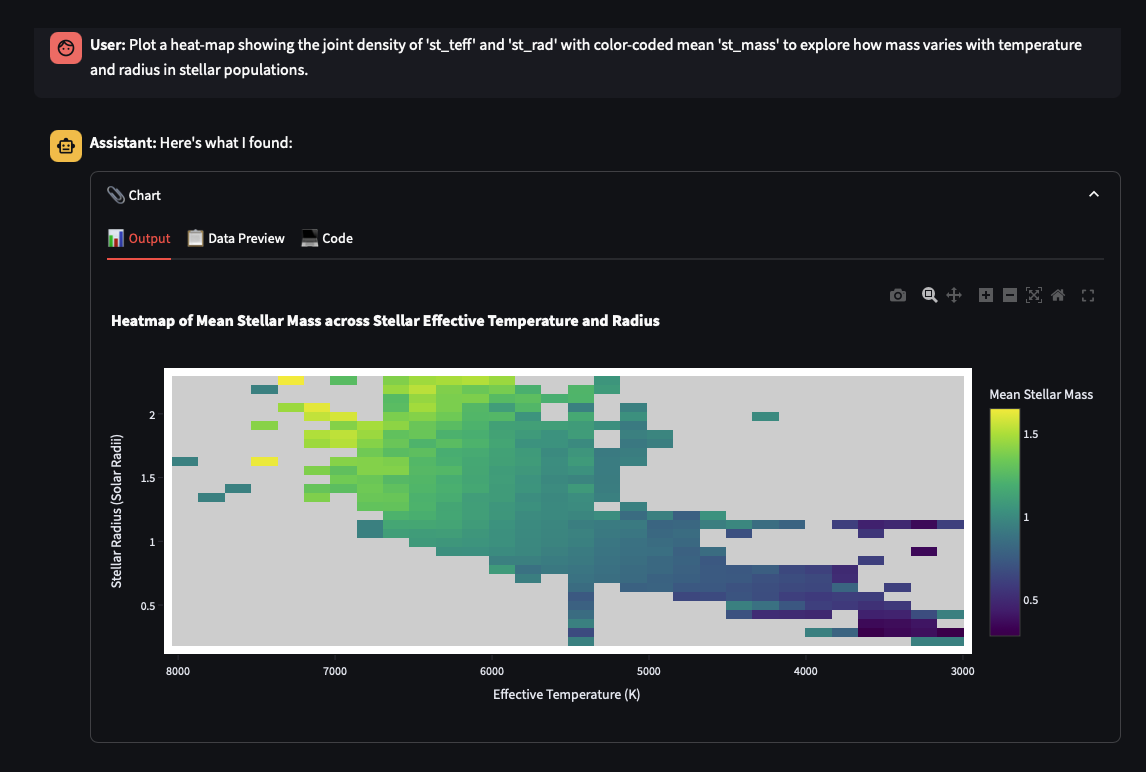
figure 1
Heatmap Figure Above
The heatmap shown above shows the joint density of effective stellar temperature (K) and radius (Solar radii) with color coded mean Mass (Solar masses) to explore how mass varies with temperature and radius in stellar populations.
figure 2
Prompt Engineering
The above heatmap was generated through context that was derived from the metadata. For example, this NASA dataset was broken down by the AI which then created the question/ or prompt that was developed by the data visualization agent.
figure 3
The Data Visualization Agent
The Data Visualization agent allows the user to have a conversation with their data and be able to visualize the charts using Plotly objects. This interactive and highly intuitive system allows users to make modifications to the charts either via natural language or direct code editing.